
Expedia

Description
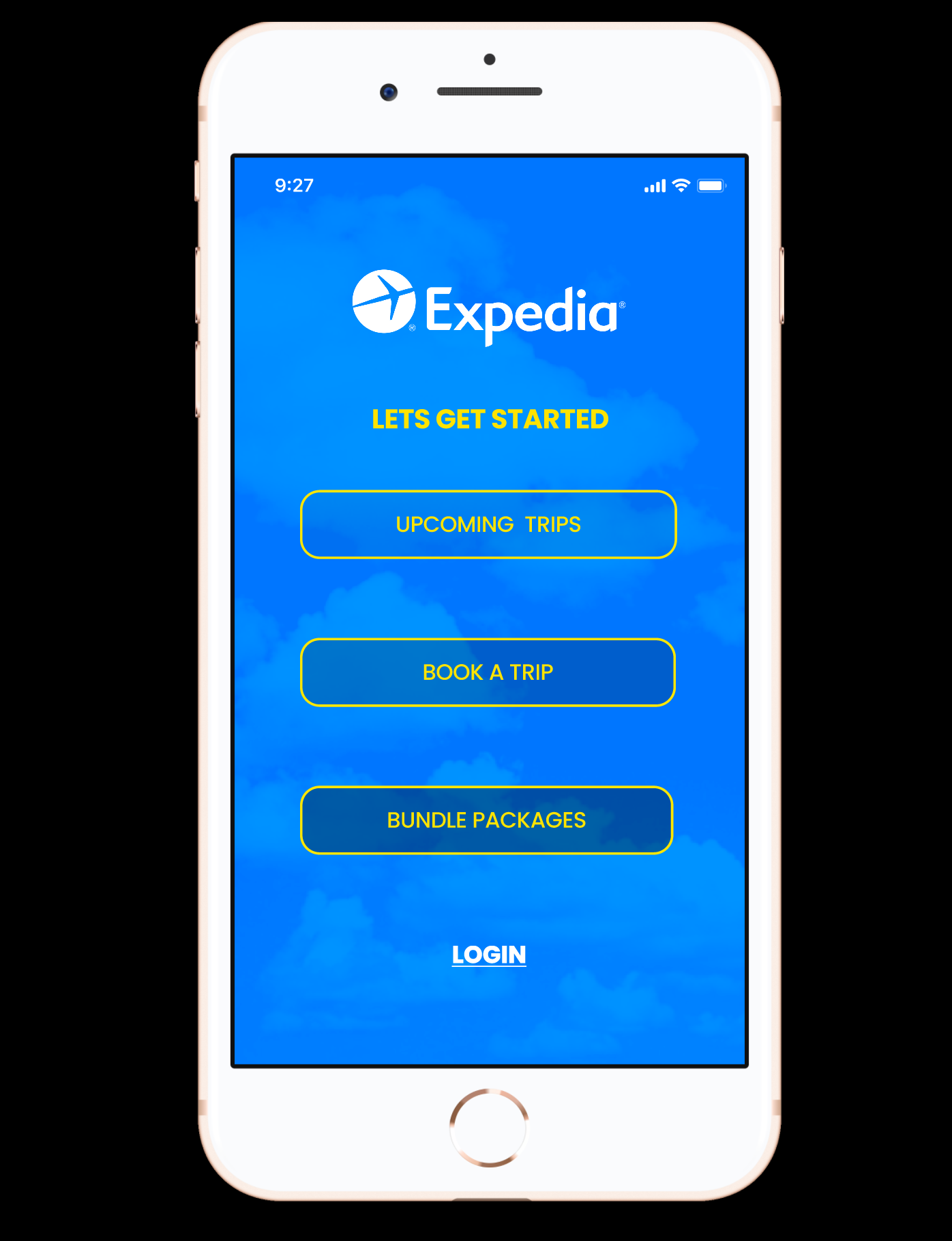
I redesigned the Expedia app to make it more sleek, simple, and streamlined.
Expedia’s app at the time of this redesign was essentially the same as its website so it was not optimized for a mobile experience. Pain points included superfluous content on a small screen and navigation issues.
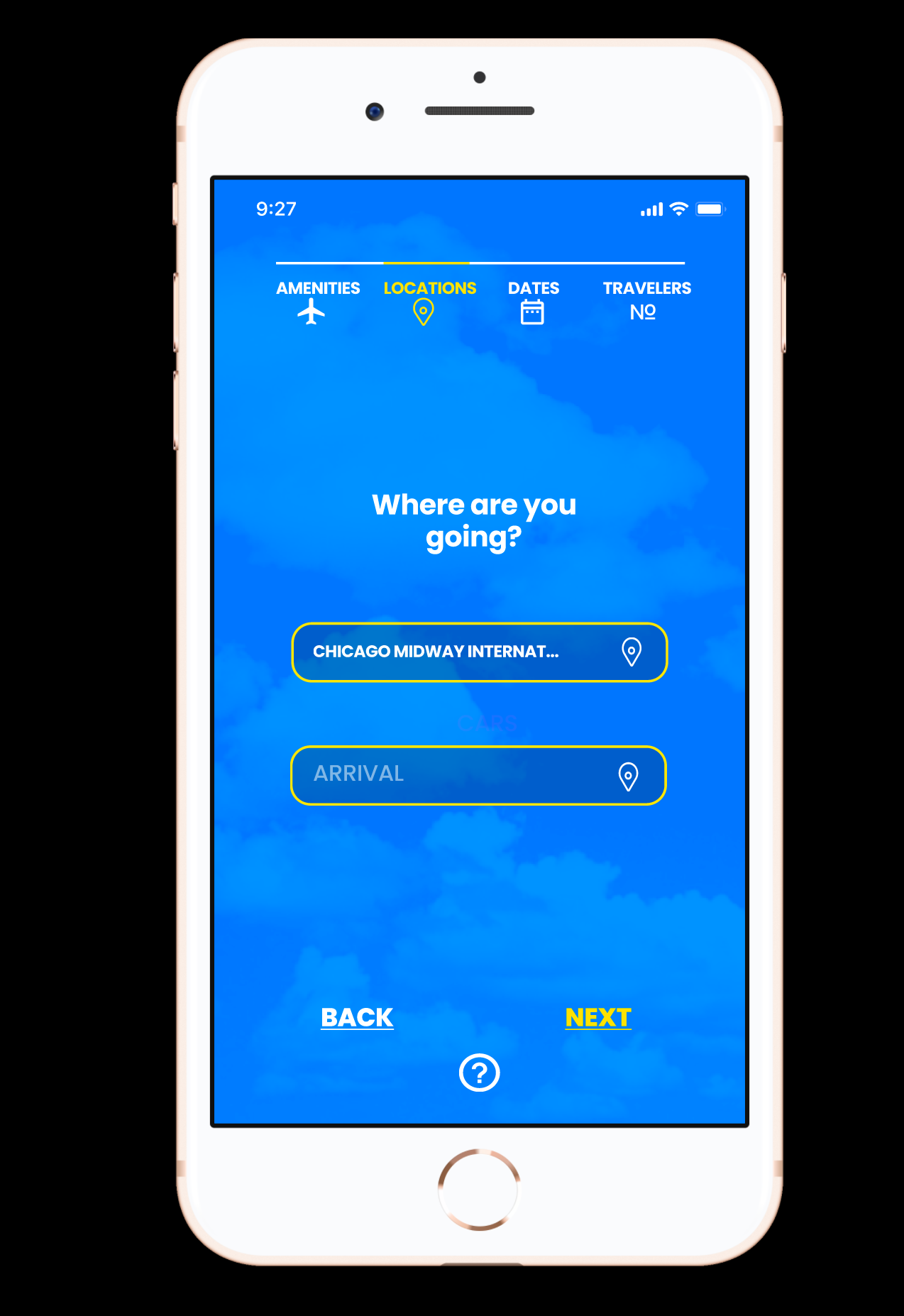
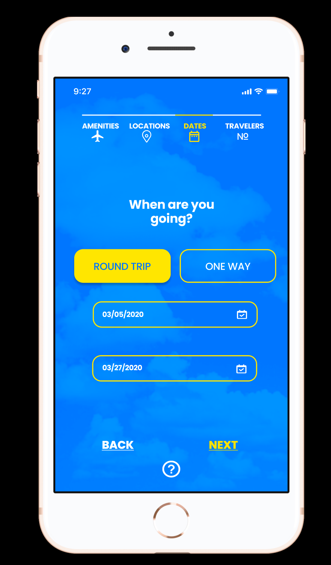
Key redesign features include a new home page with three quick action buttons, a progress bar to help users understand where they are, and fewer items on the screen.
If I were to do another redesign, I would employ icons along with the pick list items so people can identify items from the list even quicker. I would also experiment with opacity and contrast more to improve readability. Lastly, I would use a single page for this flow as users nowadays are accustomed to scrolling and may want to see all the input fields on the same page so they can quickly change previous input features, for instance.
About
Expedia is a travel shopping company. The Expedia Redesign was my first User Interface project done during my junior year at Stanford in my ME115B - Design for Human Factors class. I worked in a team of 3.